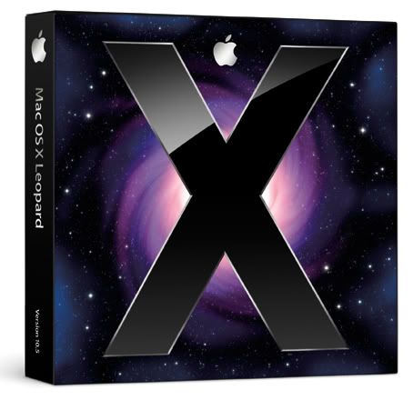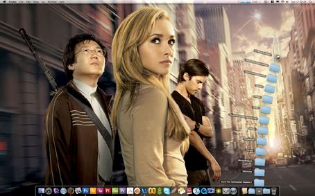
After months of delays in the development process, the new operating system for the Apple Macintosh – Mac OS 10.5 codename ‘Leopard’ – was finally release at the end of October. Apple states the new OS features over 300 new changes and enhancements, covering core operating system components as well as applications and developer tools. The biggest differences compare to Tiger (the previous Mac OS X) is the new and stylish look to the desktop.
But before I go into this with much detail, I should explain my nightmare situation when installing the new OS on my 24-inch iMac (the classic white version, not the recent revamp silver and black model).
It took me several hours to install Leopard on my main desktop computer, even though it went smoothly on my old PowerBook G4 laptop… The main cause of the problem was APE (Application Enhancer), which didn’t support Mac 10.5. At that time, I wasn’t aware of this and as I try to install it, this little APE application was causing the installing process to fail…
I should have done my research online, reading the various comments on Apple forums about what was causing my Mac to crash. In fact, it was a serious matter as I thought I had lost all my personal data including my vast collection of music, videos and images due to the fact it wasn’t booting anymore… You can tell when this happens when you are stuck on the blue screen. Yes, that’s right. Windows is not alone when you come across the ‘blue screen of death’ (a.k.a. BSOD)!
Luckily, I did a backup of my iMac’s Hard Drive by using Carbon Copy Cloner. It took three hours to ‘clone’ the 350 GB worth of data onto my external Hard Drive. It was a good thing I done this, as the installing process of Leopard proved to be a major headache…
How so? First, the Leopard install DVD failed, claiming it was unreadable. I did a restart, try the install process again but this time my iMac disc icon become unavailable, meaning you can’t install Leopard without a Hard Drive… So I restarted it again and selected the ‘repair’ option to fix it. This time Leopard can ‘see’ the iMac disc icon and was now ready to install.
It took around an hour to complete the installing process. After that, the machine will reboot back into the new desktop. But unfortunately, due to conflicts with APE, I was unable to get back in… It was then you are presented with the infamous blue screen. You couldn’t even hear the Hard Drive whirring (meaning disk activity) all you get was a cursor arrow in the top left corner in a sea of blue… I tried to restart the computer many times and each attempt was stuck on the blue screen.
So how did I fix it? Well, I used that backup to reboot back into Tiger and from there, restore the whole system based on the clone data from my external Hard Drive. This took four hours to restore… After that, I tried again! But this time, instead of selecting the ‘Upgrade’ option that worked successfully on my PowerBook G4, I now opted for the ‘Archive and Install’ option. This time it worked perfectly and was presented with a nice CGI welcome video when I got back into my desktop!
It was such a relief to see this after wasting approximately seven hours to get the damn thing to work! But now I have Leopard running smoothly and quickly, I can now explain the new features in this OS.
The first thing you will notice immediately is the new appearance to the desktop. Apple has redesigned it from top to bottom, with a transparent menu bar, a 3D look to the Dock and a new dramatic feel to the Finder windows.
The Finder in particular has a new party trick called Quick Look, which allows you to see a preview to a document without launching their associated application. To use Quick Look, just select a file in the Finder, hit the space bar on the keyboard and a window pops up displaying a read-only version of that document. It works wonderfully well with JPEGs and PDFs, with my personal favourite being video clips. By this, you can watch any movie files without the need to launch QuickTime or any movie player.

The Quick Look technology is part of the iTunes-style Cover Flow feature in Finder. Cover Flow presents files as horizontally scrolling images of their contents (just as it does with album art in iTunes). Seeing the list of files in this format is pure eye-candy but it’s only practical if the documents are graphical like photos (it doesn’t work so well if its text-based like Word files).
As for the Dock, gone is the two-dimensional panel with little black arrows pointing to running applications. This has been replaced by – quite controversially – with a three-dimensional reflective shelf with little lights… To be honest, when I saw the new Dock panel in 3D, I hated it. I immediately change this back to 2D (thanks to a little one line code in Terminal), but you still get little blue lights indicating running applications…
A new feature that comes with Leopard is called Spaces. Apple has adopted this from several other operating systems – namely Unix – by providing ‘virtual desktops’. With this, you can manage multiple workspaces with each ‘desktop’ containing different applications or file windows. This is a powerful feature as it allows you to multitask between different ‘spaces’. So for example, you can have one space for reading emails and web browsing, another for listening to your music in iTunes, another for playing a computer game while the final space can be used for organising your images in iPhoto. Apple has also added the feature of switching between spaces and even reorganising what’s running in that particular desktop.

The next cool feature is Stacks. This is meant to be a new way of organising your files by creating stacks. A stack is creating by placing a folder in the Dock – when you click on the Stack, it presents a window showing the files’ icon containing in that folder. It a small and subtle feature but I must admit its not very good. I can see why Apple devised this, as it means you have a nice and clean desktop without a clutter of random files dotting all over the place. But using it is quite tricky, as you need to create multiple stacks in order to file away your documents in the correct places on your system.
Right, onto Apple’s web browser – Safari. This has upgraded to version 3.0 with a new feature that allows you to devise your own Dashboard widget by selecting certain parts of a web page. These is very useful if you want to keep on score with the latest sports results or just want to read the latest news reports taken from your favourite websites. Safari 3.0 also has the ability to do tabbed browsing and you can even rearrange the windows by moving or dragging the tabs.
Spotlight has also been upgraded by having the ability to search on any networked computer. Previously it was confined to only one machine. In addition, you can now locate that elusive file ever faster – a major step up compared to the slow responding Spotlight under Tiger…
But one of the major key features of Leopard is Time Machine. This will change our bad habits of not backing up our personal files with more ease. Time Machine allows you to travel back in time to recover a deleted file, which is very handy if you accidentally removed an important document from the system… The interface of Time Machine looks very dramatic against that star/galaxy backdrop I might add.
The only criticism with Time Machine is the initial backup. It takes forever to copy all your important data to your backup Hard Drive. In addition, if you suffered a serious Hard Disk failure on your Mac and want to restore the system, you can’t boot from Time Machine…
Other new features with Leopard including an enhanced version of Mail (with the ability to modify the Apple-designed stationary, as well as receive RSS feeds), iChat (you can present your work in an iChat conversation plus have the ability to take control of your friend’s computer if you working on a project!), Photo Booth (now with added animated backgrounds) and of course Front Row (which looks similar to Apple TV, but I have to admit I miss the animated movie clips, which are now replaced by still frame grabs).
In conclusion, Leopard is a welcome addition to the Macintosh operating system. Sure the leap over Tiger is not as dramatic say from Mac OS 9 to Mac OS X, but in terms of functionality and form, it is easily the most impressive. In fact, after using if for over two weeks, I believe it is better than Mac OS 10.4 in terms of providing more scope to the user by managing and organising files. It even runs faster and I love the ability to glance at my documents without even opening the applications with Quick Look. So despite the nightmare of installing it, Leopard is worth the price and effort that has put in to it.


